Sue Wadden is the Color Goddess for Sherwin Williams or if you are a stickler for titles, she also is know as the Director of Color Marketing. Regardless of what you call her, she is a renown color expert who has likely affected what color we have and we will likely paint our walls. 
Recently, I was granted an opportunity to interview her which I was jittery-happy about. If you haven’t already guessed, I am a total color geek. I gaze at those tiny paint chips like others admire wallet size pictures of their grandkids.
One of the hot topics I was to anxious to discuss with Sue is the current grey craze.
Bit of background here … I have spent years utterly fascinated about the psychology of color. Since it is a well known fact that all things colored grey are pop star popular, I wanted to understand how being immersed in grey could affect your mood or psyche.
According to Feng-Shui and Beyond.com, “grey is helpful for calming and re-setting your emotions. It acts like a refuge away from any madness of the world”.
Whether you agree or disagree that being surrounded by gray walls may give you a sense of calm, what we know for sure it that gray is major trend. Plus, let’s admit the Prozac placebo effect is a rather enticing bonus.
I asked Sue “Is there was any place that wasn’t grabbing grey walls with gusto”?
She responded lightly, “Not really! North America, specifically the US, is 100% in love with grey”.
“What about Florida?” I asked, “Do you have any advice on what tone of grey is best to paint the walls of our sun drenched state?”
Sue acknowledges that, “Grey can be a complex color. By adding some warmth grey can take on a “stone greige” look that can be appealing in sunny Florida. Greige tones are a natural compliment to nature. She also recommends checking out greys with a blue cast because it reflects our sea and sky.
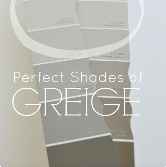
Whether you live in Seattle or Sarasota, grey is the new beige.
With that said, Sue also acknowledged, “A good rule of thumb in the trend forecasting world is that once a color is fully embraced by consumers – designers will begin to look to a new neutral.”
So, keep your eyes open as you flip through the latest glossy design magazines, you may discover the next neutral trendsetter.
Before I hung up with Sue I asked “with the endless array of paint possibilities what color did you paint your living room?”.
“Pavestone SW7642” she said, with a casual air of certainty.

Hmmm … Gotta go grab a gallon (and I am not talking milk)…be right back.
the barefooted design,


A designer should really learn the difference between “compliment” and “complement.”
LikeLike
Susie,
My compliments for brining this to my attention.
Amy
LikeLike